This Is Where The Painting Begins to Change

Starting with the grid

As noted in my previous post, every piece in this series begins the same way—a pencil grid laid down on the surface, creating the structure for everything else. It's a quiet, methodical start. The grid doesn't change, but what happens within it does.

Choosing the background colour

Once the grid is in place, my next decision is the background colour. This might seem like a small thing, but it sets the tone for everything that follows. It's the foundation that will support all the colours eventually living within each square—so it has to be right.

For this piece I chose purple. I knew I wanted to explore bright pinks and fluorescent tones, and I felt a purple base would hold and balance that energy without competing with it.

How the process keeps evolving

What's been really interesting to me is how much the process keeps evolving, even within a consistent structure. Each painting teaches me something new as I adjust how I apply the paint, experiment with different approaches, and notice what feels most alive.

There's a rhythm forming across the series. Repeating, shifting, refining. The structure stays the same; everything else is in motion.

If you're interested in collecting original paintings or prints, you can explore my available works here.

How a Painting Series Begins

Drawing a grid in pencil on the canvas getS things started.

Where This Series Begins

I've been wanting to share what's been happening in the studio lately and this new series feels ready to step into the light.

Every painting in this series starts the same way—with a pencil grid.

Once I land on a colour direction that excites me, I draw out this simple structure on the canvas. It becomes a quiet guide—a container that holds everything that comes next.

Freedom Within Limits

I've been thinking a lot about how, in creativity, having some form of limitation can actually open things up. Even with this grid in place, there's a sense of freedom within it. I get to explore, play, and respond without needing to solve the whole painting all at once.

This series really began with curiosity—an idea sparked by blocks of colour and how they might connect—and it continues to unfold from there.

More to come as it evolves.

Until then, feel free to explore my available original artwork.

The Process of Painting “A Love Letter to Myself”

A Love Letter to Myself by Deb Chaney (30” x 40”)

With my first Gabriola Studio Tour in the rearview mirror, I’m still moved by what a fantastic experience it was. And seeing how interested people are in the artistic process, I’m encouraged to share more “behind the scenes” posts. Therefore, this is the story behind my abstract painting, A Love Letter of Myself.

Mastering Mixed-Media Abstract Painting

This abstract expressionist painting began in 2020, at the height of the pandemic. During that time, I offered an online course called Mastering Mixed-Media Abstract Painting, or MMAP for short. It was 2 months long and it all took place on Zoom – which was necessary as people signed up from all over the world.

The course consisted of 3 projects and there was so much that I wanted to share with people within that short time. But in the context of A Love Letter to Myself, I’d like to focus on 2 key overarching ideas that I sought to impart to students in the workshop.

The Fundamentals of Abstract Expressionism

My first goal was that I really wanted to give them the fundamentals of abstract painting. These concepts would empower them to create paintings that support their ideas and communicate what they want to say in a visually intelligent and effective way. During this project – and the course itself – they were learning the basic fundamental elements of what you need for abstract painting to succeed as a piece of artwork.

The Mediums and Techniques of Mixed-Media Painting

The second goal I had with my workshop was to have them understand the mediums and techniques used in mixed-media acrylic painting. For example, if you walk into an art supply store and go to the aisle with all the gels and pastes and powders, it can be very daunting and overwhelming. You’ll probably just stand there, staring at the seemingly endless selection, wondering what to choose. And when you do choose something, when do you use it – and how? I didn’t simply want to give them an overview of all the mediums you can combine with acrylics, but rather show them how to really apply them.

I use a lot of different mediums to create really cool effects in heavily layered paintings like A Love Letter to Myself. It was on display during the Thanksgiving Studio Tour and it was actually the first time I’d ever shared it with the public. I got so many positive vibes and comments about it — people really loved it — and the most common question that came up was whether I had used wax. It looks so waxy, so they wondered whether it was an encaustic painting – an ancient technique popular with the Egyptians, Greeks, and Romans.

And while it is not an encaustic painting, my technique emulates wax by using translucent acrylics to create layered effects that people think are real wax. And this “encaustic formula”, as I call it, was one of the techniques I shared with my workshop.

The Many (Physical) Layers of Abstract Expressionism

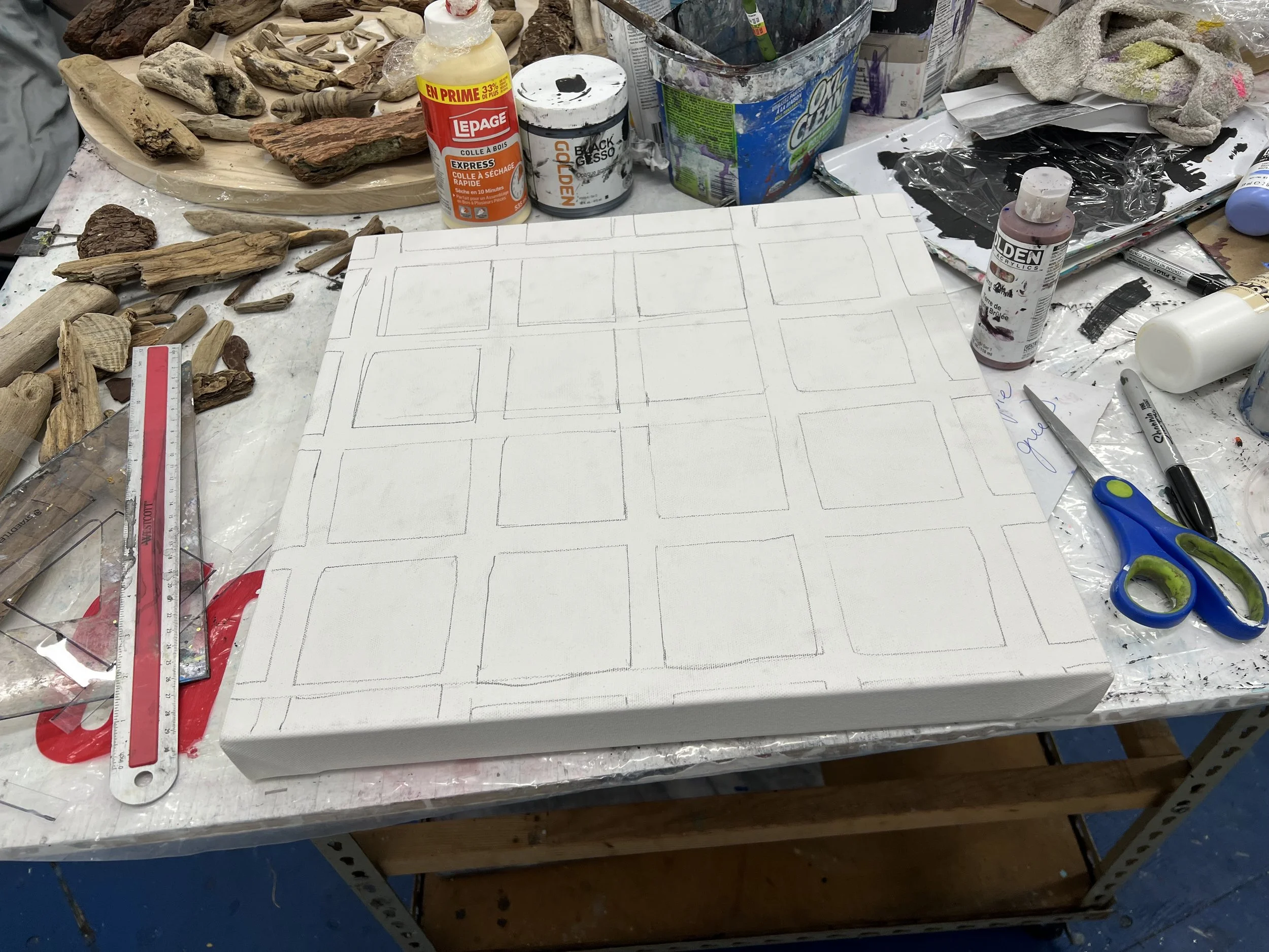
Laying the Foundation

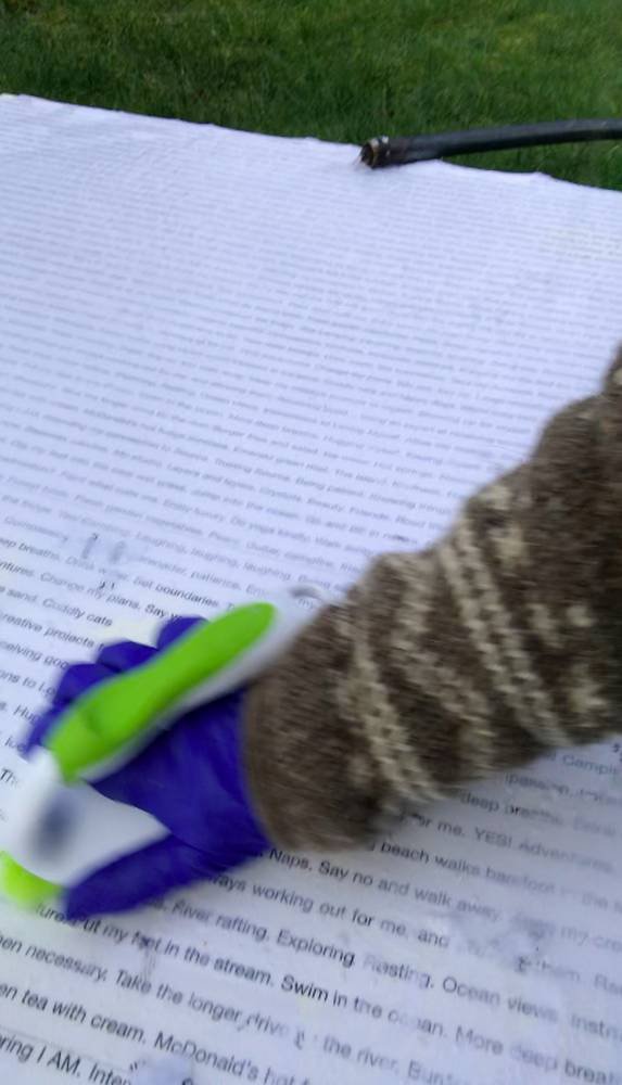
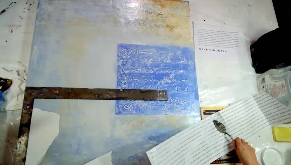
The first step in creating this painting was writing the love letter. I wrote it on my computer, just putting down the free-flowing thoughts of all the things that make me feel good and loved and spiritually nourished — and supported and safe — and give me a sense of belonging. All of these thoughts and ideas went onto the page which I then had printed at Staples on a large engineering print. I had it mirror printed, so the words were reversed – which was critical for the first step. (You can see each step in the slideshow above.)

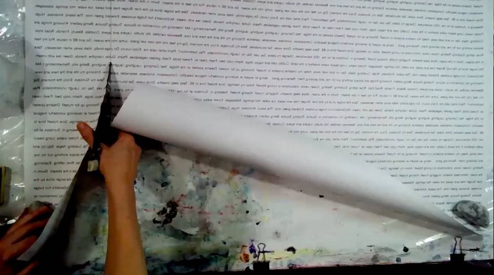
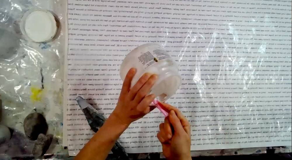
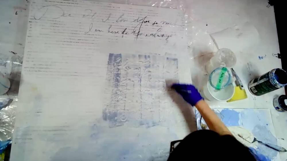
The next step (in the second picture) was applying a clear gel medium directly onto the words on the engineering print, then turning it over and sticking it face down onto the canvas. Following that, I took the canvas out in the backyard and ran the garden hose over it. Then I took a hard-bristled scrub brush and scrubbed. Then scrubbed some more. (With a 30” x 40” canvas, it was quite the workout!) But what happens is the pulp peels away and the words are left behind. And because they were mirror-printed and pasted facedown, they become legible when the ink is transferred onto the canvas.

Building Layers Upon Layers

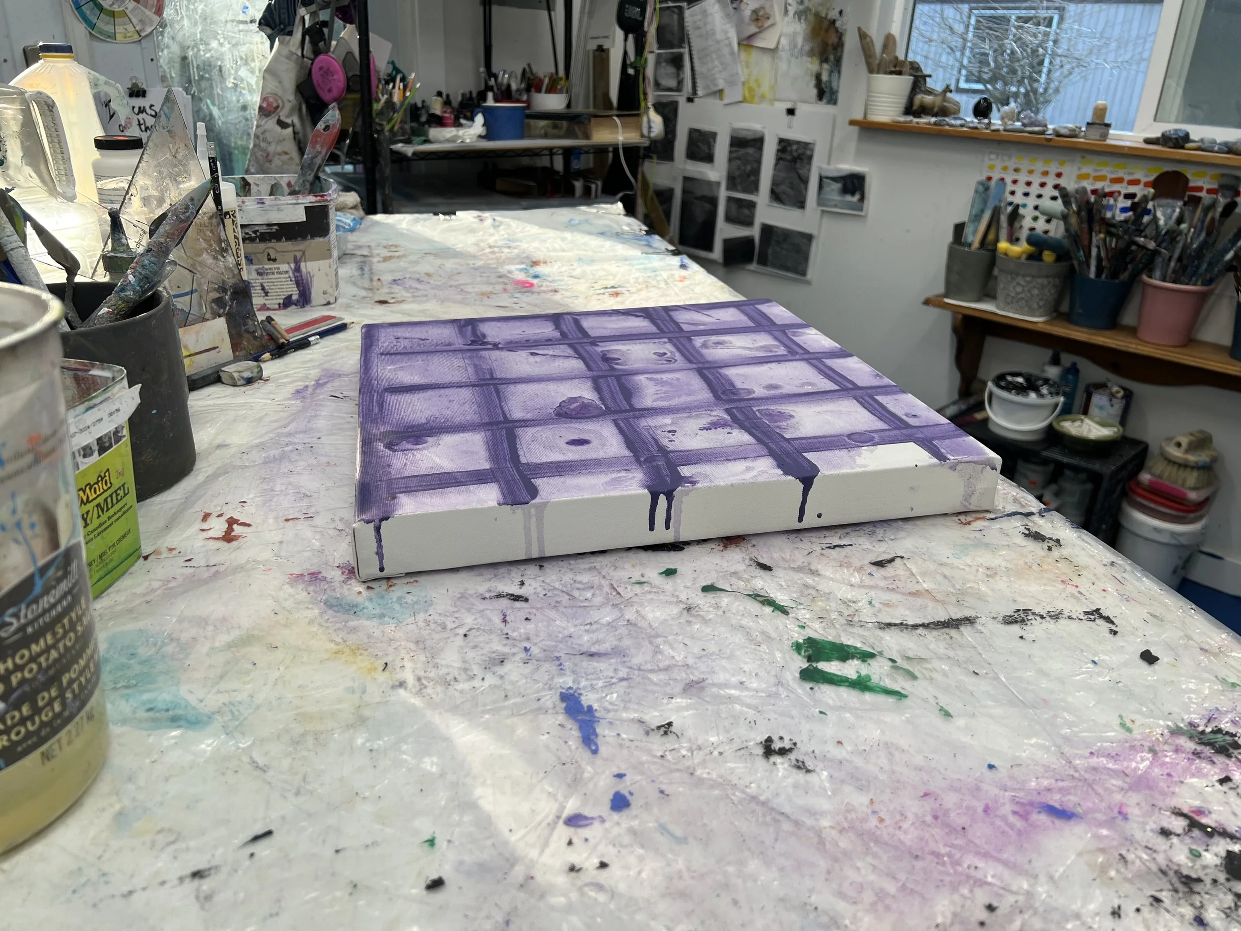
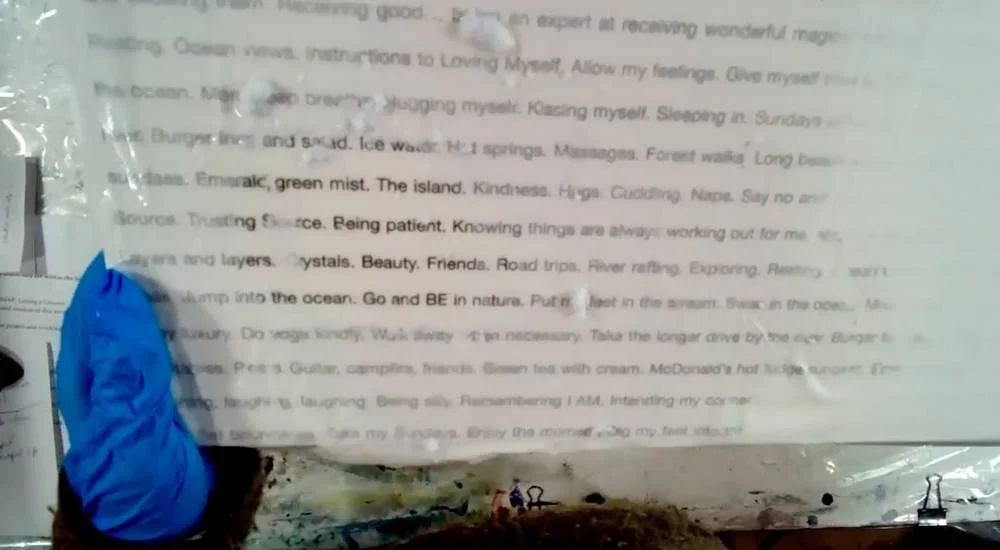
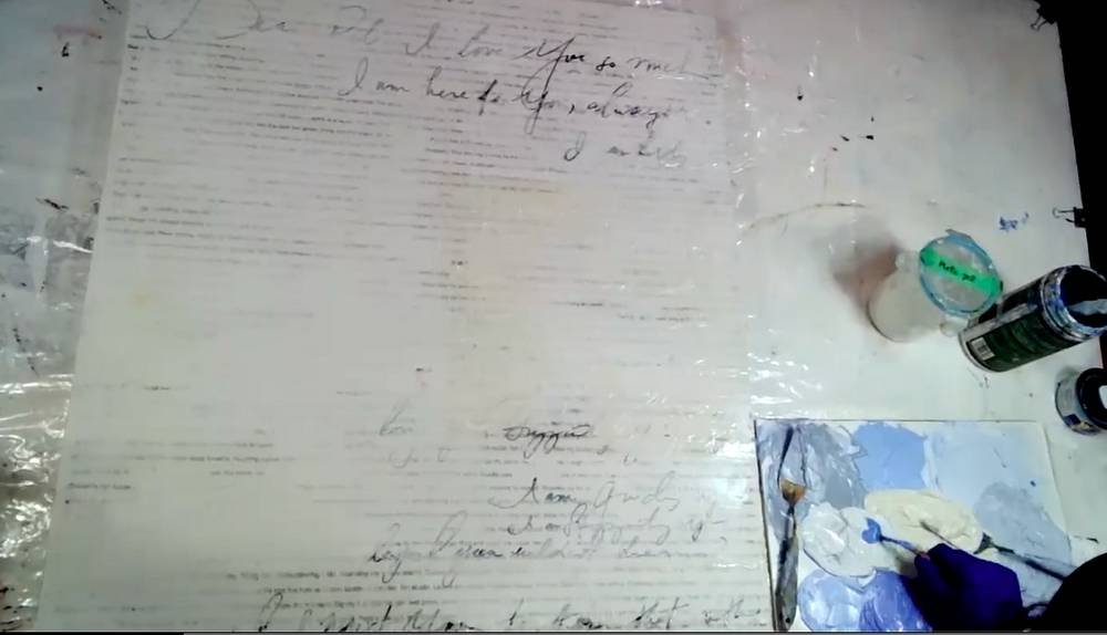
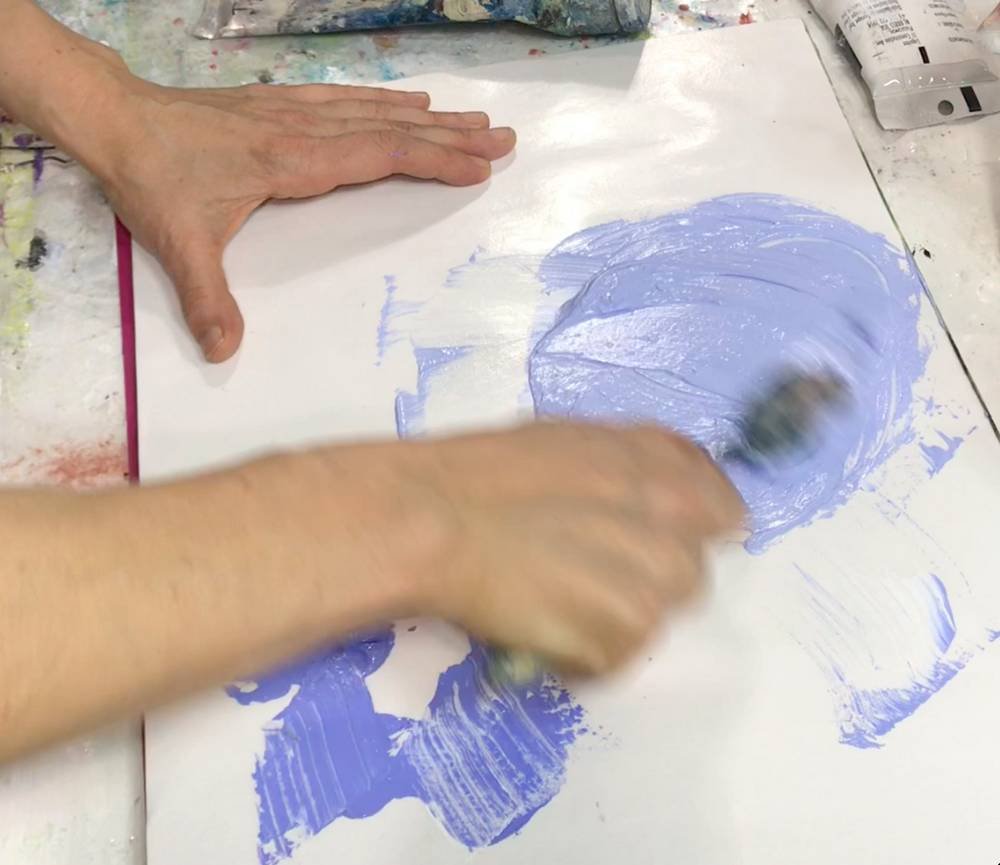
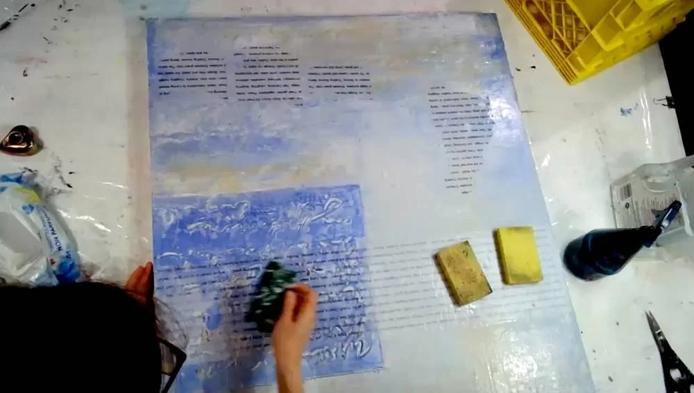
After my love letter was transferred onto the canvas, I continued on the journey by adding further layers. The next step, which you can see in the next photo, was handwriting my letter using an acrylic pen. So each layer is a new medium, as you can see I’m mixing paints on my palette in the next photo, which I applied in the next step.

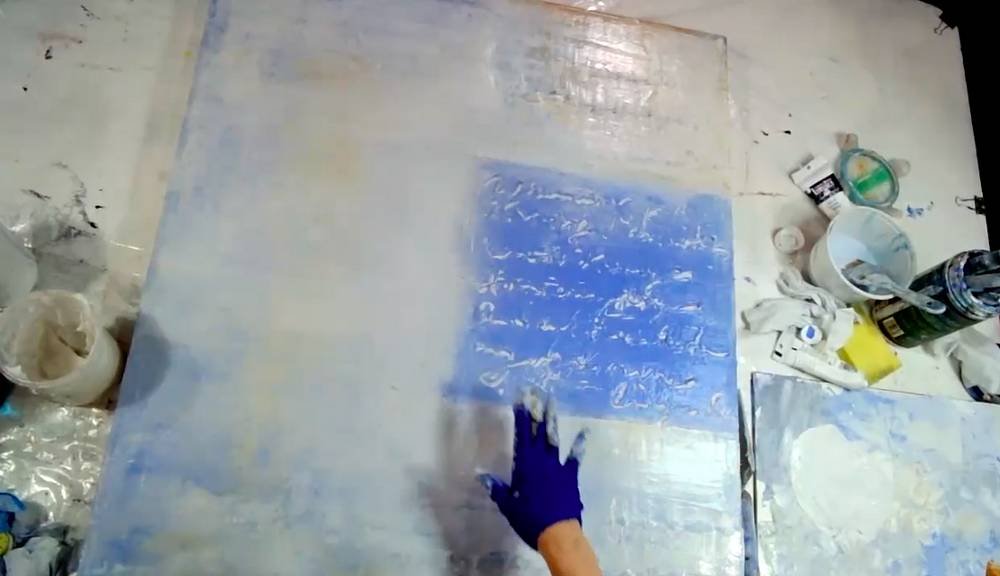
In the 7th picture, you can see me fingerpainting. And in the next 2 shots, I’m adding translucent acrylics and mediums, then laying down another layer of text in order to create these floating words. And this is the technique I most wanted to share with students, where it emulates the transparency of an encaustic painting. Then, in the final shot, I’m once again scrubbing away the pulp to reveal the letters.

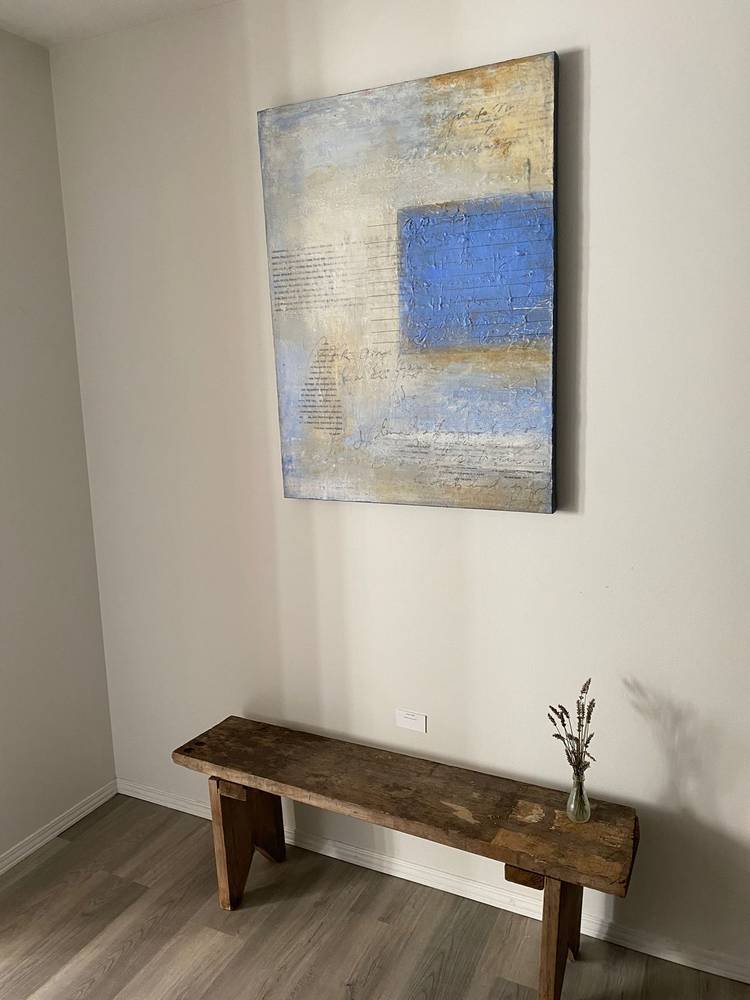
The entire process lasted for the duration of the 2-month course and, in fact, I only truly completed the painting a couple of weeks before the open studio on Thanksgiving weekend. After the course, I hung it on the wall and let it gestate until it revealed itself to me and I knew the next step. This waiting period – letting a painting just hang there unfinished – was something I was reluctant to do in the past. But I’m now quite comfortable with it, so it’s just become a step in the process.

Original artwork and prints for sale

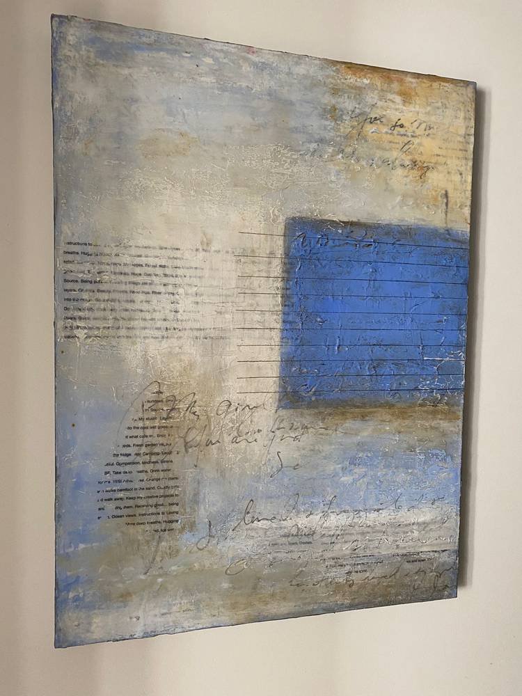
The original painting of A Love Letter to Myself is available for sale for $1,800 USD. The price does not include shipping, insurance, and tax. Please email me directly about purchase inquiries.

The painting is not up on Saatchi Art yet, but I’ll update this page as soon as it’s available and the links are online. Until then, you can browse through my collection on Saatchi Art’s online gallery. You can also find many of the paintings in my Little Gems Series on Saatchi Art. 

Saatchi Art offers multiple options to suit your personal tastes or needs. You can choose to have your print on paper or canvas and choose from 4 sizes to best fit your room. You also have the option to have it framed in white, black, or natural wood.

Behind the scenes in the studio - the process of creating DP # 1

Drishti Painting # 1
36" x 48" x 1.5" Mixed Media on Canvas

The word drishti comes from the Sanskrit word and denotes a focal point. In yoga class when you are holding a challenging pose, to help you balance, your instructor will guide you to find a drishti: a place to hold your gaze that will in turn help you to hold steady.

The paintings in this new series are visual creations uniquely and specifically for you to remind of the strength and balance that always exists within yourself.

DP #1 can be found at the AV Museum in Port Alberni, British Columbia, Canada until the end of September 2022.⁠

and online at Saatchi Online Gallery:
https://www.saatchiart.com/art/Painting-Drishti-Painting-1/499285/9464433/view

I learned a lot from creating this first painting in the series, and I have to say that I'll be switching directions with the next paintings and exploring these ideas from different angles.⁠

Stay tuned... the painting journey continues :-) ⁠